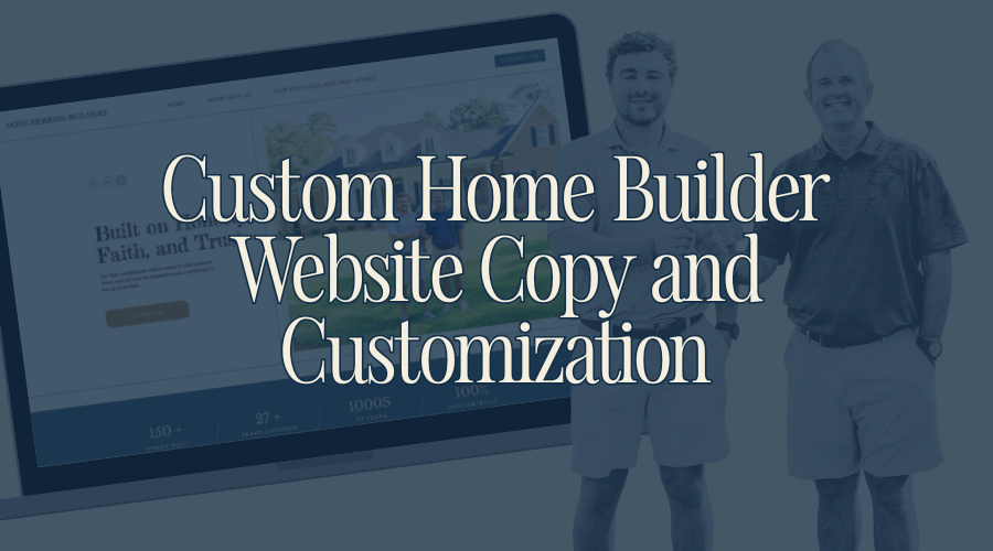
Featured Website Project For Custom Home Builder: Doug Herring Builders
categories:
Brand Identity
content strategy
website strategy
podcast
personal
Like Bob Dylan once said, “The times they are a-changing,” and the ways these times are a-changing make websites almost a near necessity to keep your business growing and maintaining.
Younger generations are getting older, and kids raised on the internet view websites as legitimate and professional as physical office buildings, so having a well-designed website can be a leg up against the competition (especially the ones that haven’t prioritized their online presence).
Doug, with Doug Herring Builders, is—and has been—well established in his local community, successfully operating as a custom home builder since 1988, but in order to prepare for the shifting avenues of access—and younger generations becoming home buyers—Doug felt like it was time to build a digital home for his home-building business.
It wasn’t Doug’s first time having a website, but his previous venture into the digital world required lots of upkeep and a dedicated IT guy to maintain and update the website. We knew from the very beginning that we wanted to design a simple, streamlined website that he and his team felt comfortable enough to maintain and update on their own.
His website’s main purposes are to be an initial sales tool and client resource for all current and potential clients.
The More Than Creative Co. team decided on a simple (and easy to maintain) four-page website:
Let’s talk about some elements of the website and how we kept it simple but intentional.
Testimonials
Homes, especially the custom homes that Doug specializes in, are high ticket items. When it comes to marketing and selling high ticket items, meaningful and specific testimonials are priceless and make an impactful difference in the mind of a potential client. Social proof that is *specific* has the highest value when corroborating the integrity and quality of high ticket items.
As a testament (haha) to the great work that Doug does, the testimonials he received back from his past clients were exactly what we needed! They were well-written, highly detailed, and really spoke to the character and craftsmanship of Doug Herring Builders.
They were meaningful to us as website builders, so they would definitely be meaningful to a potential client.
We designed the website with a few testimonial sections scattered throughout, but once we saw how many quality testimonials Doug received, we created sections on each homes’ portfolio page to showcase every testimony in full.
Seeing the testimonies beside the galleries of the final home is ideal, because it provides both visual and social proof.
(It is always a good idea to collect testimonies from clients closely after you finish working with them. That way they’re fresh, specific, and you have them when you need them—and sometimes, testimonies can be the best marketing material you have!)

The Portfolio
Not only should a website be a sales tool for the business, it should also be a resource for the client — and if done well, both can be achieved through key, simple features.
One simple feature is a portfolio, which is a great way to showcase the work without overselling. Like they say, a photo is worth a thousand words, and it is a powerful statement to let potential clients see the offerings for themselves — allowing them to learn more and become inspired along the way.
It was a no-brainer that Doug should have a living portfolio of homes on the website. This is something that other home builders in the area aren’t doing, making Doug a trailblazer in his market.
His competitors are solely relying on social media to share their homebuilding projects, unlike Doug who now has a professional, curated portfolio (broken down by home projects and featured spaces) that is easy to navigate, organized, and designed to be a click away from his contact information.
This is something he can market and share on his social media in tandem with the home’s progress, drawing traffic to his website and to his process.
We used Doug’s portfolio as an opportunity to educate clients with words to communicate their home vision effectively — words like sconces, wainscoting, Everlast siding, butler’s pantry, craftsman style columns, and more. Plus, we were able to demonstrate his craftsmanship through the professional images he collected.
Our goal was to curate the website’s portfolio as somewhat of a Pinterest board for potential clients. We want them building vision boards of their future projects with inspiration from his past projects, using the portfolio page as a resource for education and inspiration.
Now, with his website, he has a visual aid—using his own examples—to communicate with clients in their home planning process.
(We were only able to make such a well-rounded portfolio page because Doug collected so many professional—emphasis on professional—photos that we were able to immediately use. Just like testimonials, you can never be too prepared.)
The Home Page (and The About Section)
About pages are a mainstay for a lot of websites, and for good reason. It’s important for people to know who they’re working with, but sometimes, it doesn’t make sense to have an entire page dedicated to a bio, background, and life story.
The most important pages for Doug’s clientele are going to be the process and the portfolios. We didn’t want to possibly overwhelm and distract from those necessary pages with another less essential About page.
So for Doug, the sweet spot was the addition of a few paragraphs explaining his expertise, his love for it, and how long he’s been building homes, located across the most important pages of his website.
To do this, we built a site canvas (essentially, a duplicatable section), so that no matter how a potential client entered his website, they understood who they would be working with.

Doug’s website is a prime example that simple websites can still be incredibly purposeful, with every detail supporting and guiding the client through their thought processes.
For business owners like Doug, who make most of their sales over the phone, websites should provide just enough information to build confidence in the client to call, but not so much that it overwhelms them and potentially repels them from calling at all.
On the Work With Us page, we provide a step-by-step breakdown of Doug’s homebuilding process from beginning to end. However, we don’t dive into extreme detail with each step. We share just enough to explain the steps, their order, and let Doug take care of the rest.

Websites, like Doug’s, can be the initial sales tool, not the closer, and forcing a website to make the entire sale can actually push potential clients away. Sometimes, simple is best, and less is more.
Like one of my English teachers used to say, “K.i.s.s, K.i.s.s” (Keep it simple, stupid.).
