Cohesive Websites Create Client Experiences | Wedding Planner Website Copy and Customization
categories:
Brand Identity
content strategy
website strategy
podcast
personal
Brittanie Raquel Events is a premier event planning team in North Carolina. They throw some of the most exciting, well-planned, and well-themed events in Wilmington, and they wanted a website that matched their innovative reputation and recent business growth.
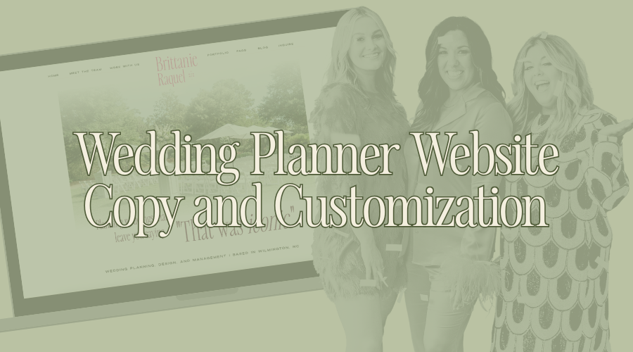
Brittanie worked with J. Ashley Innovations (who we recently began a partnership with!) to design their brand and customize a Showit website template, but quickly realized she needed elevated copy to match and complete the final design. The More Than Creative team worked with BRE to create copy that positioned them accurately in their market — as elevated wedding planning experts.
Let’s break down the strategy behind each page.
Home Page
The Home page is almost always the last page we do. The purpose of a Home page is more like an interactive site’s directory. It engages and invites users to other sections of the website. We do it last, so we know everything that needs to be included on it.
For the BRE website, right when you enter the page we centered the phrase “Planning weddings that leave you saying, ‘That was iconic.’”
It took us a few attempts to land on the word “iconic.” We wanted something that spoke to the dramatic, elevated, and intentional moments that Brittanie and her team strive to plan for in every event, but the word also had to be fun and playful and inviting to reflect the personality of the team and the brand — “iconic” was the perfect cross-section of the meaning and the feeling.
The Home page links out to every other page in order of importance to a potential client: Services (what do you do?), About (who are you?), then the Blog (Show me examples).
The most important aspect of Home page design and copy is to be equal parts engaging and informative — and the order in which it is presented should be logical to the ideal client, answering questions before they even thought to ask them.
Meet The Team
About pages have the least amount of rules. The biggest one (really, the only one) is to discuss your attributes in regards to the client — always answering the question “what does that mean for me?”
Some About pages can lose focus on the true meaning and use it as a biography or journal when it is ultimately still a sales page. Facts, ideals, values, and more should only be shared if it relates to your ideal client and relationship building (in the context of your service/product).
BRE’s About page is the perfect mix of personality and purpose and is in lockstep with the overall brand persona and design.
We wrote the About page to reflect the way clients are introduced and how they work with the BRE team — first as a team (complete with collective core values and vision) then as individuals (with specialized tastes and interests).
In my unbiased, humble opinion, I absolutely love the spotlight sections of Brittanie, Kinsey, and Roxanne. They demonstrate the multifacetedness of each member while showing that they’re logistical party girls — they work hard, play hard, and do it every weekend.
Work With Us
The Work With Us or Services page is the biggest advocate for sales on a website. It should be the most informative, and for some clients, it will be the only page they visit/care about. The quality of this page will be the largest (at times, only) decider for them.
BRE has several different packages for clients to choose from (Full Service, Partial Planning, and Wedding Management) and the way we organized them on the Work With Us page reflects the way the growth of the business is going: starting at Full Service Planning (their crème de la crème), then Partial Service clients, and finally Event Management (for those who only need the basics).
The way services are organized is incredibly important to how each service is perceived. Sometimes it is advantageous to build upon the services, unless you want to introduce (sell) the more all-inclusive (expensive) package most often.
BRE moving forward wants primarily Full Service and Partial Planning clients, so it makes the most sense to prioritize those at the top of the page, letting clients widdle down the price point to find what works best for their budget instead of working their way up.
Work With Us pages should be clear and speak directly to every type of client you’re trying to attract. This is why we included multiple ways of defining the package. We included a description of the ideal client and how BRE works with them, a listed breakdown of need-to-know inclusions, and a pull quote to give an at-a-glace descriptor of the package.
Websites, especially service pages, should have multi-pronged copy and design to be accessible to all types of learning styles and clients.
FAQ
FAQ sections are a well known aspect of sales websites, but Brittanie and her team are so well-versed in their field that they had prepared and could answer an entire page of frequently asked questions.
It was a challenge to figure out how to organize the FAQ in an easy-to-navigate, logical way, and we settled on organizing the page by steps in the process. This way clients who wanted a deep understanding of the entire process could easily read from beginning to end — on the other hand, if someone was looking for questions about specific steps, we have a top of the page navigation bar to let clients quickly find what they are looking for.
FAQ pages should still be cohesive to the rest of your website design. (I know we have all seen FAQ’s that are just endless blocks of text.) The FAQ page is purposefully designed to keep the eye moving, with pictures to visually pop, and keep users from falling asleep at the wheel.
Portfolio
For service businesses that are design-oriented, portfolios can be a huge client resource and sales tool. More Than Creative likes to describe Portfolio pages as a Pinterest page that you own, curate, and is filled with only your designs.
We knew from the beginning that BRE would have a Portfolio page to showcase their favorite weddings in a permanent fashion, working in tandem with the blog. The difference being that the Portfolio page would be even further curated than the Blog and focus solely on the designs of BRE’s top favorite weddings.
The Portfolio is a living, breathing website page that will continue to grow and be added to as BRE continues to design weddings they want to highlight – perfect for SEO!!! (In fact, MTC has already added four more weddings to the Portfolio page since the original launch date.)
The Portfolio pages are not only a gallery of images, but are paired with a two–four paragraph blurb to provide context to the design and highlight BRE’s role in the final vision coming together.
The Portfolio page’s purpose is to be a touchstone to clients for design ideas, preferred vendors, and overall event planning insights — and moving forward, BRE can use it as such, sending it to clients directly for inspiration.
Blog
A blog is a constant, all-encompassing client resource and sales tool for a business. Blogs drive SEO the most, causing search engines to rank you higher, making you show up in more searches, even if it’s simply for your area and not for the specific topics you’re posting about. They are also opportunities to educate your clients and allow them to answer their own questions first before coming to you, maximizing your time, allowing you to continue to maintain and grow your business.
For the event planning market, blogs are necessary to remain competitive since a large section of the market is out of town and finding their vendors through search engines and the internet.
When Brittanie started working with us, we knew she was going to become an on-going MTC client, so we were able to be ambitious in the blog design because we knew the MTC team was responsible for upkeep.
First and foremost, blogs should be easily accessible and navigable, and with the integration of Showit x WordPress, categories and filtering, which allows clients to get where they want quickly and efficiently, are a simple addition to any blog.
One of the things that elevates the BRE website even more is the quality of the photos.
BRE’s brand photos were done by our sister company, Dakota Hersey Photography, in tandem with the copy and design.
Every aspect of the website is in conversation with each other, from the photos to the copy to the functionality, because the MTC team had access to all of it. Dakota was able to complement the brand colors with the clothing, orient the photos correctly, and pose them well because she knew exactly where the photos would go and how they would be used on the website.
The MTC team was able to format and customize the website with intention and purpose — infusing that into the client experience, demonstrating through Brittanie’s website the type of service her clients should expect from her and her team.
Websites are an online storefront, resource, and platform. They’re a perfect way to announce to your world of potential clients that your business has entered a new stage of service — it’s exciting, it’s fresh, and when you work with an intentional team like More Than Creative, it works for you.
Take a look at Brittianie Raquel Events’ website here, and if you are a wedding professional that loves the design, reach out to our design partner, J. Ashley Innovations.
We’re looking forward to working with you!!
