Your Website Navigation Is More Important Than You Think
categories:
Brand Identity
content strategy
website strategy
podcast
personal
A key tenant of the marketing world is that “clear language sells” and the same applies to websites. Clear language sells because confusion is the enemy, it breeds a lack of confidence and makes a person less likely to want to do business with you.
If your website is confusing and difficult to navigate, then it’s going to entice someone to go back to Google before they even really give you the time.
These people are on a mission and want to go through the smallest number of clicks that get them to their final destination. These are our freeway drivers who don’t want to be taken on the scenic route, and your top navigation is your website’s freeways.
The First Thing We Do When Building a Website is Decide What Your Navigation Will Look Like.
The reason we do this is because it tells us the specific needs of your website. From your navigation, we know how many pages your website will be and what each of those pages will be about.
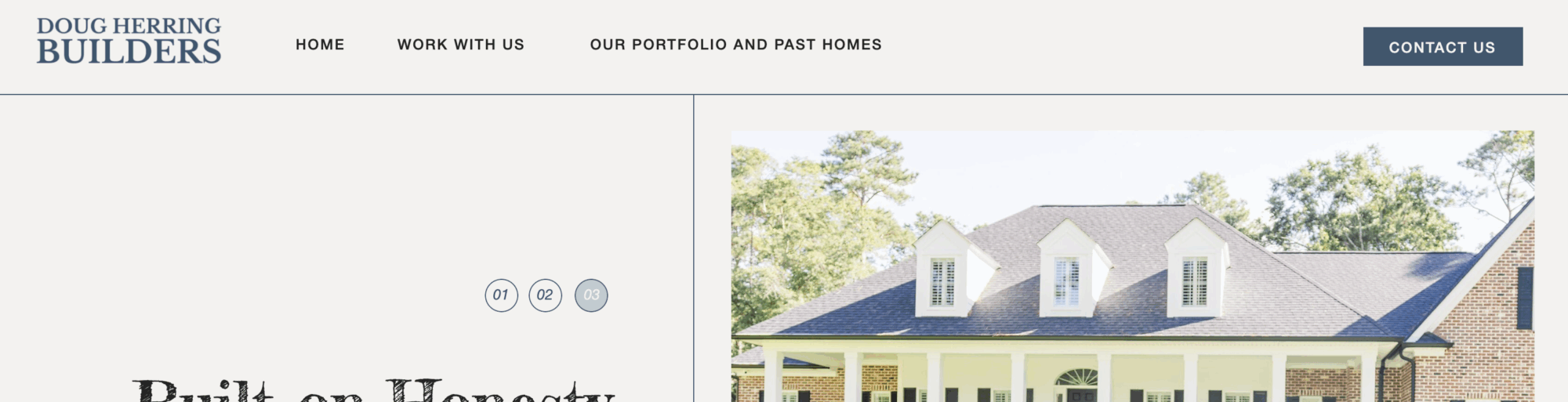
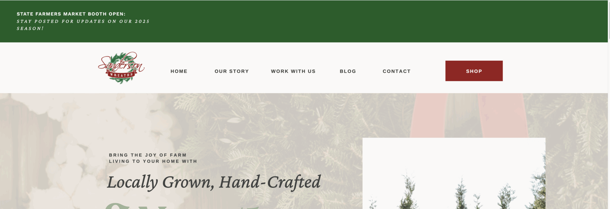
The general rule of thumb is that your top navigation is 3-7 clear, concise page titles. Avoid the desire to be different and creative here because it can cause confusion. Your industry will have standard vernacular and someone looking to work with you will be looking for those standards because that’s what they expect.
If you name a blog “My Journal,” or something else that is too clever for its own good, it’ll simply cause frustration in your potential client’s experience (which could possibly make them no longer be a potential).
Specificity and further subcategories is for the bottom navigation. This allows the client to scroll through your website looking for something specific, and if they haven’t found it by the time they reach the foot of the page, the footer acts as a store employee breezing past them in the aisle, saying “Can I help you find something more specific?” (Again, it is still important to be clear here, even if it is more specific.)
Clear Categories in your Navigation Means You Know Who You Are and What You Do.
Being able to clearly categorize your services allows you and your website to confidently sell your services. It prevents that nasty word, confusion, and builds confidence in your abilities because of it.
No one ever wants to eat at a restaurant where the menu is a three ring binder. The same applies to a website. If I am someone looking for an answer to a question I already have, I will be turned away by a website with 10 different types of navigation categories and god forbid they have drop down menus.
That’s too much clicking, too much deciphering, and will cause me to go back to Google and clarify what I am looking for.

Be confident, be concise, and let your copy be clever, not your navigation.
A typical navigation for a service based business includes Home, About, Services, and Contact. If you only have one or two different types of services, we can break those down in the top nav as well (i.e. Senior Photography and Wedding Photography).
If you have an e-commerce website, it’s also important to list Shop or Products in something big and bold because that’s where most site visitors want to go.
The bottom navigation can break it down into smaller, more specific pieces, like Senior Portraits, Bridal Portraits, Engagements, Weddings, Family, Babies, etc. (This applies to all types of businesses, not just photography.)
Your navigation helps key into what your business is really all about. Nailing it down and making it clear will help you hone in your elevator pitch when someone at the networking event asks “what do you do?”
All you have to think about is what your website says.
